Render colour beside brick
Choosing render colour beside existing brickwork
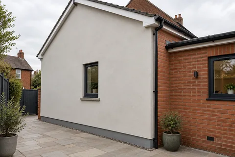
Where render sits beside brick that is staying, the brick sets the palette. Its colour, its mortar and the way it weathers make the same render shade look warmer, cooler, brighter or duller from one house to the next. This article explains how brick, mortar, stone details, texture and light affect a render colour, and how to test a choice on the wall itself.

On this page
What the brick contributes
From the street, a brick wall reads as a blend of the brick faces and the mortar between them, not as the colour of a single brick. A red brick with pale mortar looks lighter and pinker than the same brick with dark mortar. Judge render colours against that blended effect seen from the pavement, not against one brick held in the hand.
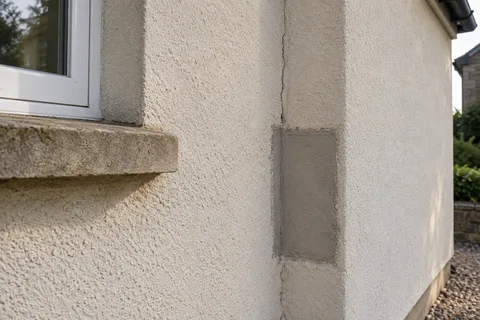
Stone details add a third colour. In the Headingley Hill conservation area, for example, the council's appraisal notes that even modest red-brick terraces have stone lintels and sills. A render colour close to that stone ties the elevation together; one far from it makes the stone stand out as a separate element.
The choice between a new render and a respray matters here. A respray changes only the colour of the existing render and keeps its texture, while a new system can change both. If the existing finish is a coarse dash and you want a smooth modern look beside the brick, a coating cannot deliver it.
| Feature | Effect on the render colour |
|---|---|
| Brick colour | Sets a warm or cool palette |
| Mortar colour | Lightens or darkens the overall brick tone |
| Multi-tone brick | Several tones to echo or contrast |
| Stone sills and lintels | A third colour to relate to |
| Window frames | Strong contrast with dark or white frames |
Texture and light change the colour
The same colour looks darker on a rough surface than on a smooth one, because the texture holds small shadows. A coarse dash or a 3.0mm silicone grain reads deeper than a fine 1.0mm grain or a smooth painted render in an identical shade, so choose the colour on the texture you will actually have.
Orientation matters too. A north-facing terrace front spends most of the day in shade, which makes pale colours look grey; a south-facing one in strong sun can make the same colour look washed out. Look at samples on the wall that will be rendered, at the times of day you usually see it.
Weathering shifts colours over time. Pale renders pick up grey streaks below sills and copings, while brick darkens gradually, so a slightly warmer mid-tone render can stay closer to the brick as both age.

Matching, blending or contrasting
There are three broad approaches. Matching aims for a render close to the blended brick colour so the house reads as one mass. Blending picks a lighter or darker tone from the same family so render and brick sit together without competing. Contrasting chooses a clearly different colour, often pale against red brick, so the rendered parts read as deliberate panels.
Each suits different houses. On a terrace where the neighbours are all bare brick, a blending colour can make one rendered front sit more quietly in the row. On an extension, a contrast can make the new part read as intentionally different from the original house.
For rendering in Leeds, the colour question comes after the condition question: whether the wall needs a new system, a repair or a recoat decides which finishes and textures are available at all.
Comparing a few colours fairly
Keep the shortlist to two or three colours and test them side by side on the same wall, so the light and the brick are the same for each. Change one thing at a time: if the samples differ in both colour and texture, it is hard to tell which is driving the preference.
Look from two distances. From across the street you see the balance of brick and render over the whole front; from the gate you see texture, edges and how the colour meets the stone sills and frames. A colour that wins from one distance can lose from the other.
For example, on a hypothetical red-brick through-terrace with stone sills and white frames, a sensible shortlist might be an off-white, a warm stone shade close to the sills and a soft grey. Painted as trial squares side by side on the front, the off-white would make the brick look redder and the frames disappear, the stone shade would tie brick and sills together, and the grey would cool the whole front down. Seeing all three on the wall at once makes the choice much clearer than any card.
Photograph the samples for the record, but make the decision on the wall rather than on a screen, because cameras and displays shift colour noticeably.
Making a sample that tells you something
A useful sample uses the real product in the real texture on, or right beside, the wall it will cover. Structherm recommends a sample to check colour and final appearance for its silicone masonry paint, and a test panel for its silicone topcoat, which is a sensible habit for any finish. Make it big enough to judge from the street, and put it where the render will meet the retained brick, not on a spare corner in shade.
Let it dry fully before deciding. Wet render and wet paint look darker than they will be, and some finishes lighten noticeably as they cure. Look again in morning and late-afternoon light, on a dull day and a bright one.
Record exactly what the sample is: product, colour reference, grain or texture and, for coatings, batch. Through-coloured renders vary between batches and with how they are finished; Parex, for instance, asks for one batch per facade and for each elevation of its monocouche to be scraped at the same stage. If the approved sample came from a different batch from the one delivered, ask before it goes on the wall.
Finally, mark where the colour starts and stops: corners, reveals, plinths and any feature panels. A good sample and a clear boundary drawing together are the instruction; either one alone leaves the installer guessing.
Common questions
Should the render match the brick exactly?
It does not have to. An exact match is hard because brick varies and weathers, and many schemes look better with a render one step lighter or darker than the blended brick colour.
Does the mortar colour matter if the brick is staying?
Yes. The mortar is part of the colour you see from the street, so judge render samples against the whole wall, joints included.
See housing and planning information for Leeds and nearby places, including the source and geography behind each figure.